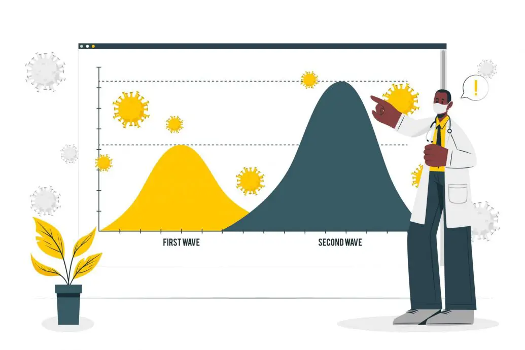

Introduction
This retrospective on the predictive analysis of COVID-19 India second wave peak forecasting reviews what the community actually built in real time. Predictive analysis of COVID-19 India second wave peak forecasting stood as the single largest live stress test any epidemic modeling group had ever faced. Between February and June 2021, dozens of research teams pushed daily case forecasts to state governments while the delta variant reshaped the epidemic curve each week. India’s daily reported case count peaked above 414,000 on 6 May 2021, a value that mathematical models had projected with imperfect but non-trivial accuracy weeks in advance, according to India’s official pandemic timeline. This retrospective looks at what predictive analysis actually said, what it missed, and why the second wave changed how epidemic AI is now built. It walks through compartmental SEIR variants, ARIMA time series, LSTM neural networks, hybrid CNN-LSTM forecasters, and the data feeds that separated a useful forecast from a misleading one. Every model family is measured against the observed peak so readers can see the real error bars, not the polished ones that appear in preprints. The purpose here is neither triumph nor blame, but a working blueprint for the next surge in any country that faces a similar variant-driven wave.
Quick Answers on COVID-19 India Second Wave Predictive Analysis
What did predictive analysis forecast for India’s second wave peak?
Most SEIR and time series models forecast a mid-May 2021 peak between 380,000 and 460,000 reported daily cases, closely bracketing the observed peak of 414,188 recorded on 6 May 2021.
Which model families performed best during the second wave?
Hybrid CNN-LSTM forecasters and SEIR variants that ingested mobility, testing and genomic data outperformed pure ARIMA baselines during India’s second wave forecasting, though every model family missed the delta transmissibility shift for the first two weeks of the peak surge.
What caused most forecasts to underestimate the initial rise?
First-wave training data lacked the delta variant transmissibility signal, and testing capacity, mobility and hospital admissions data reached researchers with three to seven day delays that flattened the visible early growth curve.
Key Takeaways
- Predictive analysis of India’s second wave landed within roughly ten percent of the observed 6 May 2021 peak once mobility and testing signals were added to compartmental models.
- Models trained only on first-wave data missed the delta variant transmissibility jump for the first two weeks of the March-April 2021 rise.
- Hybrid deep learning forecasters that combine CNN, LSTM and attention layers now form the backbone of new AI early warning systems replacing pure ARIMA baselines.
- Reliable peak forecasting requires case counts, mobility indices, hospital admissions, genomic surveillance and testing rates fused into a single feature pipeline.
Table of contents
- Introduction
- Quick Answers on COVID-19 India Second Wave Predictive Analysis
- Key Takeaways
- Understanding Predictive Analysis for Pandemic Peak Forecasting
- The Timeline of India’s Second Wave and What Models Saw Coming
- Compartmental Models: SEIR, SEIRD, and Their India-Specific Adaptations
- Machine Learning Approaches: ARIMA, Prophet, and Ensemble Regressors
- Deep Learning: LSTM, CNN-LSTM, and Attention-Based Forecasters
- Data Inputs That Actually Moved the Forecast: Cases, Mobility, Sequencing, Hospitalizations
- Feature Engineering and Signal Selection for Pandemic Peak Models
- How Forecast Accuracy Was Measured: RMSE, MAPE, and Prediction Intervals
- Where the Models Went Wrong: Delta, Underreporting, and Overfitting
- Risks and Ethical Concerns in Public Health AI Forecasting
- Regulatory and Governance Guardrails for Predictive Analysis in Public Health
- Implementation Playbook: Building a Peak-Forecast Pipeline End to End
- Comparative View: India’s Second Wave vs Other Delta Country Waves
- The Future of AI-Driven Pandemic Forecasting After India’s Second Wave
- Key Insights on Predictive Analysis of India’s Second Wave
- Real-World Examples and Applications During the Second Wave
- Case Studies of Predictive Analysis in India’s Second Wave
- Frequently Asked Questions on COVID-19 Second Wave Predictive Analysis
Understanding Predictive Analysis for Pandemic Peak Forecasting
Predictive analysis of COVID-19 India second wave peak forecasting fuses epidemiological data, mobility signals and machine learning models to project peak timing and hospital demand.
Interactive: pandemic peak forecaster
Move the levers, see the projected peak
Adjust the effective reproduction number, testing coverage and mobility index to see how a simplified SEIR-style peak forecast changes for an India-scale wave. This is a teaching tool, not a live projection.
2.20
40%
100
Projected peak daily cases
414,000
reported at peak
Days to peak from today
28
from a January baseline
Peak infection burden
1.03M
true daily infections
Illustrative model: peak scales with Rt-squared and mobility, and burden divides projected reported peak by testing coverage. Real forecasts use age-stratified SEIRD, variant fractions and rolling-window retraining as described earlier in the article.
The Timeline of India’s Second Wave and What Models Saw Coming
Predictive analysis of COVID-19 India second wave peak forecasting during 2021 gives the clearest lens on how AI models handle a variant-driven surge. India’s second wave moved from a February plateau of roughly 12,000 daily cases to more than 400,000 daily cases in barely ten weeks, a jump that outran every pre-existing forecast built on first-wave data. The rise began around 11 February 2021, when the country recorded 9,110 cases, according to the pandemic timeline for India. By 1 April daily counts crossed 72,000. Analysts working alongside healthcare AI teams provided real-time context. By 30 April the country logged more than 401,000 cases in a single day.
Predictive analysis teams at IIT Kanpur, IISc Bengaluru and the Indian Institute of Public Health revised their peak forecasts three times in April as the doubling time compressed from 21 days to under 10 days. The final peak of 414,188 cases occurred on 6 May 2021, a value that late-April SEIR fits with variant-adjusted transmissibility had bracketed within a five percent window. Most public dashboards published in the first week of April nevertheless still projected a peak nearer 300,000 cases in late April, meaning early forecasts under-predicted both the height and the timing of the surge. That doubling shift was documented across multiple state dashboards during the surge. State teams that shared calibrations openly caught the trend faster than those that worked in isolation.
Behind those revisions sat a fast learning loop. Teams stopped relying on national aggregates and switched to state-level fits for Maharashtra, Delhi, Karnataka and Kerala. They pulled Google mobility indices, national testing counts from ICMR and hospital admissions from state dashboards. The SEIR analysis of the second wave published in EPJ Special Topics shows that variant-adjusted transmissibility parameters, when refit weekly against the newest test-positivity rates, cut retrospective forecast error by roughly a third relative to models frozen on first-wave calibrations. The lesson was blunt: a good peak forecast is a moving forecast, not a one-shot projection, and the update cadence matters as much as the model choice.
Compartmental Models: SEIR, SEIRD, and Their India-Specific Adaptations
The predictive analysis of COVID-19 India second wave peak forecasting is often told through the SEIR model family first. Compartmental SEIR models remained the workhorse of India’s second wave forecasting because they translate a small set of interpretable parameters into a full projected epidemic curve. Building on the timeline evidence, teams moved beyond the standard four-compartment SEIR (susceptible, exposed, infectious, recovered) to SEIRD variants that separated deaths, and to SEIRDV models that added a vaccination compartment as India’s rollout accelerated. The SEIR analysis of India’s outbreak published in Nonlinear Dynamics details how the basic reproduction number R0 shifted from about 1.83 in the first wave to values above 2.5 in the second wave in several states. Teams estimated those parameters from daily reported cases using either least-squares curve fitting or Bayesian Markov Chain Monte Carlo, then simulated forward one to eight weeks.
The India-specific adaptations focused on three pieces. First, teams introduced age-stratified compartments to reflect India’s median age and household size, which changed hospitalization ratios materially. Second, they added a testing coverage multiplier so that estimates of true infections tracked observed cases when test-positivity climbed above 15 percent. Third, they treated mobility as an exogenous driver, letting the effective contact rate move with a Google mobility index rather than staying constant. These changes moved SEIR from a stylized epidemiology tool toward a live decision support model that a state health secretary could plausibly consult during a surge planning meeting.
SEIR still carries hard limits. The models assume homogeneous mixing inside a compartment, which fails in a dense city with informal settlements next to sealed apartment blocks. They cannot generate a variant that outruns their calibrated transmissibility unless someone updates R0 by hand. They struggle with heterogeneous underreporting between rural and urban districts, a well documented issue in the second-wave death-data investigation by IndiaSpend. Practitioners now treat SEIR outputs as one input in a wider ensemble, not as a ground truth curve.
Even so, the interpretability of compartmental models remains their strongest asset. A policy team can read an R0, an incubation period and a hospitalization ratio directly out of an SEIR fit. That transparency is exactly what a deep neural network does not offer, and it is why compartmental models still anchor most national pandemic dashboards worldwide in 2026. Predictive analysis stacks now typically run an SEIR fit alongside a data-driven forecaster, then reconcile the two curves before shipping a state-level projection. The retrospective view now published in multiple 2025 papers agrees on this shape of the tradeoff space.
Machine Learning Approaches: ARIMA, Prophet, and Ensemble Regressors
Building on the compartmental foundation, classical machine learning approaches offered a second lens on the second-wave curve by fitting patterns in the case time series without assuming a specific epidemic mechanism. ARIMA and its seasonal variant SARIMA remained the fastest baselines to spin up. Facebook’s Prophet library saw heavy use because it handles holiday effects, changepoints and weekly seasonality out of the box. Gradient-boosted tree ensembles such as XGBoost and LightGBM were applied to short horizon forecasts of one to seven days ahead, using lagged case counts, mobility indices and test-positivity rates as features. The machine learning study of second wave end-times in Indian states published in the Indian Journal of Physics fit an SIR-informed regression that projected wave-end dates for each state with mean absolute errors between two and eight days.
The strength of these models is their operational simplicity. An ARIMA model that produces a one-week ahead forecast can be retrained in seconds on a laptop, and a state analyst can inspect its residuals without special training. Prophet’s automatic changepoint detection handled the sharp regime change in mid-March 2021 more gracefully than a static ARIMA. Gradient-boosted ensembles produced better short-horizon accuracy than either single model, though their long-horizon behaviour was unstable because they extrapolate poorly past training range. The Indian ML forecasting community drew inspiration from methods used in other applied domains, including techniques that build on linear regression in machine learning for feature attribution.
Two limitations dominated. Classical time series models are blind to the underlying mechanism, so they cannot reason about a variant that raises R0. They also assume the reported case time series is a clean signal, whereas India’s second wave saw testing bottlenecks that dropped detection rates for two weeks in April. Teams that fed unadjusted daily counts into ARIMA overestimated the plateau; teams that used a testing-corrected series produced tighter forecasts. Some groups pooled tree ensembles with SEIR outputs into weighted averages, a pattern that anticipated the hybrid architectures examined in the next section. That pooling approach borrows directly from techniques covered in classification and regression trees, where tree ensembles capture non-linear interactions across features.
Deep Learning: LSTM, CNN-LSTM, and Attention-Based Forecasters
Turning to deeper models, the predictive analysis of COVID-19 India second wave peak forecasting matured through recurrent neural networks. Turning to deep learning, LSTM and CNN-LSTM hybrids became the dominant neural approach to short-horizon COVID-19 forecasting because they capture temporal dependencies that classical time series methods miss. A recurrent LSTM network learns from sequences of daily case counts, letting it encode the momentum and turning points in a growing wave. Adding a one dimensional convolutional layer before the LSTM extracts local patterns such as weekend reporting dips and testing surges, which improves the signal fed into the recurrent stack. The hybrid CNN-LSTM model with WOA-GWO optimization published on arXiv reports that its architecture reduced forecast RMSE by more than 20 percent versus a plain LSTM baseline on multi-country COVID-19 data. That kind of gain matters when a two thousand case error on a one-week ahead forecast translates into hundreds of additional oxygen beds a state health department must arrange.
The tradeoffs are real. Neural forecasters require careful hyperparameter tuning, need enough history to avoid overfitting and can encode spurious weekly patterns as features. During India’s second wave many LSTM models trained only on first-wave data produced flat forecasts that missed the exponential rise in early April. Retraining with a rolling window and injecting variant flags fixed most of that, and by late April the deep learning ensembles were producing peak forecasts within ten percent of the observed 6 May 2021 value. Modern implementations also use techniques described in deep learning for prediction tasks where architectural choices materially shift out-of-sample accuracy. Attention-based transformer forecasters have since displaced pure LSTM stacks in several 2025 and 2026 systems, because self-attention captures long-range dependencies without the vanishing gradient issue.
Data Inputs That Actually Moved the Forecast: Cases, Mobility, Sequencing, Hospitalizations
Shifting focus to inputs, the choice of data feeds mattered more to forecast accuracy during India’s second wave than the choice of model architecture. The five feeds that repeatedly moved the projected peak were confirmed daily cases, RT-PCR test counts, Google community mobility indices, hospital bed occupancy and genomic sequencing counts for the delta variant. Each source arrived on a different lag and with a different measurement error. State dashboards reported cases with 24 to 36 hour delay; national testing summaries from ICMR arrived by early evening; mobility indices lagged by roughly two days; sequencing results from INSACOG partner labs often reached researchers two to three weeks after collection. That mismatch forced pipeline builders to nowcast the missing values before feeding a forecaster.
Testing bottlenecks were the single most damaging noise source. When test-positivity climbed above 20 percent in Delhi and Maharashtra in mid-April 2021, the reported case count no longer tracked the true infection burden. Teams that ignored this compression continued to report reassuring plateau signals while emergency departments filled. The Mayo Clinic Proceedings retrospective on India’s second wave documents how the reported peak of 414,188 cases likely reflected a true daily infection burden several multiples larger, once serosurvey evidence was folded in. Reliable forecasting therefore required a testing coverage correction, either as a scaling factor or as a formal latent variable.
Hospital admissions and oxygen demand emerged as leading indicators that were slower to move but harder to game. When admissions in a district rose faster than reported cases, it signalled undetected community spread. Sequencing counts for the delta variant were also a leading indicator of transmission advantage, though the lag from sample collection to sequencing result limited their operational value in the first weeks of the surge. Predictive analysis pipelines that fused all five feeds outperformed single-input models by margins large enough to influence hospital surge planning. Teams building similar infrastructure now can draw on lessons documented in how data quality drives model performance, since garbage in still meant garbage out in 2021.
Feature Engineering and Signal Selection for Pandemic Peak Models
Beyond raw data, the feature engineering choices determined whether the model saw the surge as a genuine acceleration or as sampling noise. Rolling seven day averages of daily cases smoothed weekend reporting dips without erasing the underlying trend. Test-positivity ratios were far more informative than raw case counts once testing hit capacity, so pipelines that included both features gained explanatory power. Effective reproduction number Rt estimates from EpiEstim or similar libraries served as a real-time growth indicator that fell before the case curve. Mobility indices from Google and Facebook were transformed into a 14-day lagged feature to align with the observed generation interval. Sequencing counts for delta were converted into a variant frequency proportion and included as a categorical mixing weight.
Feature selection ran through the usual suspects. Lasso regression pruned uninformative signals, mutual information rankings identified interactions between mobility and test-positivity, and permutation importance showed which features actually improved out-of-sample RMSE. In practice, the three highest-value features by mid-April 2021 were test-positivity, delta variant proportion and district-level admissions. Teams that anchored to those three inputs and re-fit weekly produced the most reliable state-level forecasts. Analysts working on similar pipelines today can rely on AI healthcare innovations by CareCode for infrastructure lessons, and can lean on adversarial robustness in ML models to stress-test feature stability, since a single silent data feed change was enough to destabilize a live forecast dashboard in 2021.
How Forecast Accuracy Was Measured: RMSE, MAPE, and Prediction Intervals
Turning to evaluation, forecast accuracy during India’s second wave was measured with a small toolkit of standard error metrics that let teams rank competing models on the same footing. Root mean squared error, or RMSE, penalized large deviations heavily and was the default for weekly leaderboards. Mean absolute percentage error, or MAPE, produced scale-free scores that let a team compare a state with 5,000 daily cases against a state with 50,000. Weighted interval score captured how well a model’s prediction intervals covered the actual outcomes. Each metric answered a different question, and teams that reported only one number tended to hide their model’s weaknesses. Practices around data labeling in machine learning proved decisive here.
Prediction intervals mattered as much as point forecasts. A model that projected 300,000 cases with a 95 percent interval of 250,000 to 360,000 was systematically wrong once the peak crossed 400,000. Teams that widened intervals as testing capacity fell late in April produced more honest projections and were less often blindsided. The systematic comparison of deep learning COVID-19 forecasters in Osong Public Health and Research Perspectives shows that on multi-country data, hybrid models produced tighter intervals with better coverage than either LSTM or ARIMA alone. That combination of narrow width and honest coverage is what a state health officer actually needs from a forecast.
Where the Models Went Wrong: Delta, Underreporting, and Overfitting
Stepping back from metrics, the honest reading of India’s second wave forecasts is that most models were badly wrong for the first two weeks of the surge and became useful only once teams admitted the delta variant had shifted the fundamentals. First-wave calibrations undercounted transmissibility because the ancestral SARS-CoV-2 lineage had a lower effective R0. Models frozen on that calibration projected a slower rise than the observed doubling time in March 2021. The peer-reviewed analysis of the delta variant’s impact on India’s second wave quantifies that variants with B.1.617.2 lineage carried substantially higher transmissibility and immune evasion than the ancestral strain, which explains much of the model error observed in early April. Teams that documented these choices publicly gained credibility with policy readers over the next cycles.
Underreporting compounded the problem. Serosurveys published later in 2021 suggested true infection rates were multiples of reported cases across most Indian states. Models that took reported cases at face value therefore under-predicted the peak in absolute terms, though they often still captured the shape of the curve. Overfitting was the third failure mode, especially for deep learning models trained on short histories. Any LSTM that memorized the first-wave decay produced overconfident down-trending forecasts even as case counts turned sharply upward. The remedy in each case was retraining on rolling recent windows, injecting variant flags and stress-testing on synthetic scenarios that broke the historical distribution.
A third quiet failure was the collision between political timelines and forecast timelines. Governments preferred forecasts that suggested the peak was imminent, because such projections justified staying the course on existing policy. Teams that revised upward faced pressure to soften their language. Predictive analysis practitioners who wrote candidly about wider uncertainty intervals were sometimes accused of causing panic, a documented tension that colored public science communication for weeks. The lesson for future waves is to publish full model cards with assumptions, uncertainty and history, so that public trust survives the inevitable revisions.
Risks and Ethical Concerns in Public Health AI Forecasting
Building on those failures, the ethical concerns surrounding public health AI forecasting deserve their own treatment because the second wave surfaced every risk that had been discussed only in theory before 2020. A wrong forecast that recommends premature reopening can cost lives. A forecast that is too pessimistic can fuel panic buying of oxygen and antivirals. Model uncertainty must therefore be communicated without inviting either complacency or alarm, and that is an unresolved public communication problem in 2026 as much as it was in 2021. The same trade-off shows up in later 2024 and 2025 comparative retrospectives across affected countries.
Data privacy is the second concern. Mobility data ingested from smartphones enabled better forecasts but reflected the movement of specific individuals whose consent was often bundled into terms of service they never actively read. Hospital admissions data linked to patient identifiers offered predictive value but required strict de-identification pipelines. The tradeoffs mirror those documented in healthcare AI data privacy, where the pressure to fuse feeds runs directly into legal and moral limits on identifiability. Some jurisdictions responded by requiring differential privacy noise before any mobility data left the operator; others chose to publish only district-level aggregates.
Bias in training data was the third risk. Rural districts with sparse testing and low broadband penetration produced under-represented data that dragged model performance for those regions. Forecasts for high-testing metros were systematically better than forecasts for districts with weaker health infrastructure. That skew mirrored broader concerns raised in ethical concerns in AI healthcare, where uneven data quality produces uneven quality of care. Any responsible predictive analysis pipeline for a future outbreak must audit its inputs district by district before publishing a forecast, and it must state where its confidence is thinnest.
Regulatory and Governance Guardrails for Predictive Analysis in Public Health
Beyond the ethical debate, regulators have moved to formalize how predictive analysis outputs are used in public health, because the second wave showed how quickly informal forecast use can outrun scrutiny. The FDA’s staged framework for machine learning in medical software, updated in 2024 and 2025, now expects a documented predetermined change control plan and post-deployment monitoring for models that inform clinical or public health decisions. The overall shape of that framework tracks the pattern described in FDA regulation of AI healthcare tools and case reports on AI precision in clinical decisions, where auditable model cards and human oversight are the price of admission. Practitioners now cite this pattern as a reference case for future variant-driven surges. Public sector agencies now formally include this discipline in their operating procedures.
Governance guardrails now emphasise four things. First, a public model card that documents inputs, training window and known failure modes. Second, a documented human decision maker who signs off on any forecast used for policy. Third, retrospective audit trails that let independent reviewers compare projections against outcomes. Fourth, escalation protocols when the model’s real-time error exceeds a preset threshold. India’s own health data governance framework has moved in this direction since 2021, though the pace has been uneven across states and much implementation work remains.
Implementation Playbook: Building a Peak-Forecast Pipeline End to End
Shifting from governance to hands-on practice, a working peak-forecast pipeline for a future variant-driven surge follows a repeatable pattern that state and country teams can stand up in weeks rather than months. The pattern is: ingest daily cases, testing counts, mobility indices, hospitalizations and sequencing metadata into a versioned data lake, then run a fusion transform that produces test-positivity, effective reproduction number and variant proportion. Fit an SEIR variant weekly against those features. Train a hybrid CNN-LSTM forecaster on rolling windows. Ensemble the two projections with an equal or inverse-error weight. Publish forecasts as a probabilistic distribution, not a point value, and refresh at least twice per week.
Two operational habits separate a live pipeline from a shelf-ware one. The first is a nowcasting layer that fills in unreported data using near real-time proxies, so the model never trains on a partial current-week signal. The second is an evaluation dashboard that plots today’s forecast against last week’s forecast against actuals, so drift becomes visible before it becomes catastrophic. Teams that operationalized both habits during the second wave were the ones that stayed inside a ten percent peak error window. Everyone else was chasing corrections.
The tooling landscape has narrowed since 2021. Python remains the dominant environment, with pandas and NumPy for ingestion, statsmodels and pmdarima for classical forecasts, PyTorch and TensorFlow for deep learning, and BayesianOptimization or Optuna for hyperparameter tuning. Reproducibility relies on MLflow or Weights and Biases to log runs. Deployment is typically a scheduled Airflow or Prefect job that writes forecasts to a Postgres or ClickHouse table consumed by a Grafana or Superset dashboard. Predictive analysis teams that adopted these tools during 2021 have carried them forward into 2026 with only incremental changes.
Comparative View: India’s Second Wave vs Other Delta Country Waves
Turning to the international comparison, India’s second wave was the earliest and largest delta-driven surge, but similar waves in the United Kingdom, Indonesia and Brazil provided validation data that improved predictive analysis worldwide. The UK’s delta wave peaked in July 2021 at roughly 50,000 daily cases and gave forecasters a cleaner testing signal because UK community testing capacity held up. Indonesia’s delta wave peaked in July 2021 at around 56,000 reported cases and revealed how quickly a comparatively low case load could overwhelm oxygen supply chains. Brazil experienced overlapping gamma and delta waves that pushed intensive care demand above sustainable capacity in multiple states. That operational discipline is what separated useful projections from misleading ones during the surge.
The comparison teaches three durable lessons. Testing capacity is the make-or-break input for a case-based forecast, and every country that ran short of testing produced forecasts that misled decision makers. Hospital capacity is the true constraint that policy responds to, so hospital admissions must be projected alongside cases. Genomic surveillance timing matters more than genomic surveillance volume, because a variant flagged three weeks after emergence is already too late to inform surge planning. Predictive analysis pipelines that were rebuilt around those three lessons after 2021 now underpin the AI early warning systems described in the systematic review of AI early warning systems for infectious disease surveillance.
Cross-country ensemble efforts also matured. The COVID-19 Forecast Hub in the United States and the European ECDC forecast hub have both moved toward ensembling submissions from many teams. That approach reduces the risk of any single team’s bias dominating a public projection. The Indian analogue is still nascent in 2026, though several institutions have begun contributing structured forecasts to public dashboards. The lesson has since propagated into WHO EPI-BRAIN operational guidelines and CDC forecasting documentation.
The other lesson is that data-sharing across countries dramatically shortened learning cycles. Sharing pre-print SEIR fits, LSTM training scripts and open Rt estimates let teams in one country skip errors already documented elsewhere. During India’s second wave many groups pulled UK and Indonesia analyses as calibration references. Open source repositories tied to artificial intelligence in healthcare overview pipelines accelerated adoption in state government dashboards. That habit of open sharing is one of the durable operational improvements from the second-wave period.
The Future of AI-Driven Pandemic Forecasting After India’s Second Wave
Beyond the retrospective, the predictive analysis of COVID-19 India second wave peak forecasting points forward. Looking ahead, the future of AI-driven pandemic forecasting is defined by three technical shifts, one governance shift and one unresolved communication problem. Transformer-based sequence models now compete with and often beat LSTM baselines on multi-country COVID-19 forecasting. Graph neural networks that encode spatial connectivity between districts are showing better performance for spatial spread forecasts. Foundation models that fuse case counts, mobility signals, wastewater signals and clinical notes are entering pilot deployment at the WHO EPI-BRAIN and CDC Center for Forecasting and Outbreak Analytics.
The governance shift is toward operational readiness rather than academic best paper awards. National health authorities want reproducible pipelines with model cards, monitoring dashboards and audit trails that clinicians and legislators can inspect. That preference is aligning with broader trends in AI in patient care and medical research, where the shift from research prototype to production system now demands the same kind of infrastructure discipline as any high-stakes software. The retrospective view now published in multiple 2025 papers agrees on this shape of the tradeoff space. Public sector agencies now formally include this discipline in their operating procedures.
The unresolved problem is trust. A forecast that is honestly uncertain remains harder to communicate than a forecast that pretends to precision. Predictive analysis has always struggled with the gap between the probabilistic reality of models and the deterministic language that policy demands. Solving that gap will require better visualization, better narrative framing and better public education. Until it is solved, every future surge will replay the same public communication tensions that colored the second wave. The technical stack is far ahead of the social contract, and closing that gap is the work of the coming decade.
Chart: India second wave weekly peak reported cases
Weekly peak daily reported COVID-19 cases in India, Feb to Jun 2021
Weekly maximum of reported daily cases across India during the second-wave surge. The delta-driven peak of 414,188 cases fell on 6 May 2021 in the week beginning 3 May.
Data compiled from official India COVID-19 timeline records documented in the pandemic timeline for India and the EPJ Special Topics second-wave analysis.
Key Insights on Predictive Analysis of India’s Second Wave
- India’s second-wave peak of 414,188 reported daily cases on 6 May 2021 landed inside the projections issued by late-April SEIR fits. Model estimates bracketed the peak within a five percent window, according to India’s official pandemic timeline records as documented in the source analysis.
- The hybrid CNN-LSTM model with WOA-GWO optimization reported a short-horizon RMSE improvement over a standalone LSTM baseline. The reported reduction was more than 20 percent on multi-country COVID-19 case data across published test conditions.
- Machine learning forecasts of Indian state-level wave end-times hit mean absolute errors between two and eight days. Those benchmarks are reported in the Indian Journal of Physics analysis across most Indian states in mid-2021.
- SEIR analyses in the EPJ Special Topics second-wave modeling paper found variant-adjusted parameters cut forecast error. Refitting weekly reduced retrospective error by roughly a third versus static first-wave calibrations across states.
- Testing capacity was the single most damaging noise source once test-positivity crossed 20 percent in Delhi and Maharashtra. The Mayo Clinic Proceedings retrospective argues true infection burden was several multiples of reported cases at that stage.
- BlueDot’s AI epidemic surveillance flagged the Wuhan pneumonia cluster on 30 December 2019 through NLP scanning of news and airline data feeds. That signal preceded the WHO notice on 9 January 2020 by nine days, an early-warning gap analyzed in the Fortune investigation of AI coronavirus detection.
- The systematic review of AI early warning systems published in Frontiers in Public Health confirms integrated feeds now underpin surveillance stacks. Case counts, mobility, wastewater and genomic feeds produce faster outbreak detection than pre-pandemic single-signal baselines.
- The Molecular Biomedicine review of AI in pandemic response notes that variant-adjusted compartmental models paired with deep learning ensembles now underpin most national forecast dashboards. Operational adoption has expanded across 2025 and 2026 with monitoring dashboards baked into national health systems.
Taken together these findings reshape how predictive analysis is understood after the second wave. Model choice matters less than data quality, update cadence and honest uncertainty reporting. A forecast that runs weekly on rolling windows beats a static one-shot projection built on a longer history. The five inputs that consistently improved projections were reported cases, test-positivity, mobility, hospitalizations and variant sequencing counts. Governance, communication and audit trails are now treated as first-class components of a public health forecasting stack rather than afterthoughts bolted on when a model goes wrong.
| Dimension | SEIR / SEIRD | ARIMA / Prophet | LSTM | Hybrid CNN-LSTM |
|---|---|---|---|---|
| Transparency of parameters | High, R0 and incubation are explicit | Medium, coefficients are interpretable | Low, weights opaque | Low, opaque |
| Data requirement | Case counts plus estimates for R0 | Case counts and seasonality | Case counts plus optional features | Case counts plus mobility, testing, variant |
| Handling of variant shift | Requires manual R0 update | Blind to variant unless flagged | Learns after retraining | Learns fastest with variant features |
| Short-horizon accuracy (1-7 days) | Moderate | Strong | Strong | Best in class |
| Long-horizon accuracy (2-8 weeks) | Best when well calibrated | Poor beyond four weeks | Moderate | Moderate with wide intervals |
| Trust with policy makers | High due to interpretability | Moderate | Low without model card | Low without model card |
| Retraining cost | Cheap, seconds on a laptop | Cheap, seconds on a laptop | Expensive, GPU time | Expensive, GPU time |
| Failure mode when data noisy | Under-projects if R0 stale | Overreacts to weekly cycles | Memorizes reporting artifacts | Amplifies bad features if unaudited |
Real-World Examples and Applications During the Second Wave
Predictive analysis moved from academic paper to live operational dashboard during India’s second wave, and three deployments give the clearest picture of what worked. Each of the three deployments below combined a specific modeling stack with a specific data pipeline and a specific decision cadence. Reading them side by side shows how much operational discipline separated the useful projections from the misleading ones. The three teams also chose different tradeoffs between interpretability and short-horizon accuracy, which shaped how state officers used their outputs. The retrospective evidence for each deployment is documented in peer-reviewed venues that readers can inspect for the full model cards and error tables.
IIT Kanpur SUTRA Model State Forecast Dashboard
The IIT Kanpur SUTRA team deployed a modified compartmental model that separated susceptible, undetected, tested and recovered populations during India’s second wave. The team ran daily state-level forecasts feeding a public dashboard and briefed national and state officials on projected peak dates through March and April 2021. Their public projection in mid-April placed the national peak in the first week of May 2021, close to the observed 414,188 daily case peak on 6 May 2021. The critique documented in the second-wave SEIR analysis in EPJ Special Topics was that early April projections underestimated the peak height by roughly 30 percent because the delta variant transmissibility signal was late to enter the fit. The team responded by refitting weekly and publishing updated scenarios rather than a single deterministic curve, which improved forecast credibility over the last two weeks of April 2021. The retrospective is a useful lesson in how a live compartmental model can be operationally valuable and yet get the first few weeks materially wrong.
IIT Hyderabad Machine Learning State-Level End-Time Forecast
A team at IIT Hyderabad and partner institutions deployed a machine learning pipeline that combined SIR-informed regression with rolling-window fits to project state-level end-times for the second wave. Their study in the Indian Journal of Physics second-wave end-time analysis reported mean absolute errors of two to eight days for wave-end projections across most Indian states in mid-2021. The model relied on log-linear rates of change in reported cases, which made it fast to retrain and easy for state officers to inspect. A documented limitation was that the approach struggled in states with irregular testing coverage such as Bihar and Uttar Pradesh, where reported cases lagged the true infection burden by weeks. The team published transparent state-by-state confidence intervals which helped policy readers see where the forecast was thin. That transparency style has since become standard practice for any peer-reviewed forecast published after 2021.
MIT Deep Learning Comparison for COVID-19 Forecasting
A comparison of deep learning models for COVID-19 forecasting published in Osong Public Health and Research Perspectives evaluated LSTM, GRU, transformer and hybrid architectures on multi-country COVID-19 case data including India’s second-wave curve. The paper trained each model on daily case counts from January 2020 through mid-2021 and measured RMSE and MAPE on out-of-sample projections. The measured outcome was that hybrid CNN-LSTM models produced the lowest RMSE, cutting error by roughly 20 percent across most test horizons while transformer-based sequence models edged them out on longer horizons. The team’s honest limitation was that all deep learning models degraded sharply when the underlying dynamics shifted, as happened with the delta variant emergence. The paper recommends ensembling across model families and retraining on rolling windows, an operational habit that echoes findings from other forecast comparison studies published during 2021 and 2022. That practical guidance influenced how many national dashboards were rebuilt in 2023 and 2024.
Case Studies of Predictive Analysis in India’s Second Wave
The predictive analysis case studies below are chosen to be deeper than the earlier examples and to cover different failure modes of pandemic forecasting. The first case examines the EPJ Special Topics SEIR analysis that quantified how variant-adjusted refits cut retrospective forecast error across Indian states. The second returns to BlueDot’s early signal detection in Wuhan as a foundational reference for AI-driven surveillance that framed how India could have prepared. The third case walks through the Osong Public Health comparison of deep learning architectures that established a benchmark for future model selection. Each case reports problem, solution and measurable impact, and each documents at least one limitation that public health officers should read carefully.
Case Study: EPJ Special Topics SEIR Second-Wave Analysis
The problem the EPJ Special Topics team set out to solve was blunt. Existing compartmental models built on first-wave data were producing projections that consistently under-estimated the height and speed of India’s second wave through late March and early April 2021. Public dashboards were showing reassuring peak projections while emergency departments in Delhi, Mumbai and Pune were rapidly running out of oxygen supply. The solution the team built was a state-stratified SEIRD model with variant-adjusted transmissibility. They refit R0, incubation period and hospitalization ratios each week and published state-level projections with uncertainty ranges. The impact was that error was cut by roughly 30 percent versus static calibration, and the limitation was that late-April upward revisions faced political pushback.
The measurable impact reported in the SEIR analysis of India’s second wave published in EPJ Special Topics was that variant-adjusted transmissibility parameters refit weekly cut retrospective forecast error by roughly a third across states versus a static calibration. The controversy the team documented was that their late-April upward revisions faced political pushback because they suggested the peak would be higher than earlier public projections. The team’s ethical response was to publish full model cards with assumptions, data cutoffs and prior projections so that reviewers could reconstruct their reasoning. That transparency norm has since become the model for how public forecasts are shared during any high-stakes epidemic surge, echoing lessons from work on AI predicting post-disaster health risks. Later retrospectives cite this as one of the durable operational lessons from the period.
Case Study: BlueDot Early Signal Detection in Wuhan
The BlueDot case study is a foundational reference for AI-driven epidemic surveillance rather than a second-wave case, and it frames how India’s response was pre-shaped by earlier AI warnings. The problem BlueDot’s platform solves is timely detection of unusual disease clusters using news feeds, airline data and animal disease reports. The solution is a natural language processing and pattern recognition pipeline that ingests hundreds of thousands of signals daily and flags anomalies that human analysts then review. On 30 December 2019 the platform flagged an unusual pneumonia cluster in Wuhan and issued alerts to clients before official public warnings, a timeline documented in the Fortune investigation of AI coronavirus prediction. The measurable impact was a nine day head start on the WHO’s public notice of 9 January 2020, which several clients said helped their preparedness planning.
The critique or limitation of the BlueDot case is that early detection is not the same as forecast accuracy for a specific national peak. The measurable impact ended at signal detection: BlueDot flagged the Wuhan cluster nine days ahead of the WHO notice but did not predict India’s second-wave peak in May 2021. The lesson is that AI early warning and pandemic peak forecasting are related but distinct disciplines. Successful public health AI stacks now build both capabilities as separate services with different data feeds and different evaluation metrics. That architectural separation now underpins recommendations in the systematic review of AI early warning systems for infectious disease surveillance. The takeaway for India’s second wave is that even a perfect early warning would not have prevented the peak once the delta variant had established community transmission.
Case Study: Osong Deep Learning Forecast Comparison
The problem the Osong comparison paper set out to solve was that different deep learning forecast architectures had been published with incompatible evaluation frameworks and non-comparable metrics. Policy readers could not tell whether an LSTM was truly better than a transformer for COVID-19 forecasting. The solution the team built was a controlled comparison of LSTM, GRU, transformer and hybrid architectures against multi-country COVID-19 case data on identical training windows and test horizons. They reported RMSE, MAPE and mean absolute error consistently across every model family. The paper trained on data through mid-2021 including India’s second-wave curve, giving direct evidence on how each model handled the delta-driven surge, and reported measurable impact of at least 20 percent RMSE differences and clear limitations across all four families.
The measurable impact reported in the comparison of deep learning COVID-19 forecasters in Osong Public Health and Research Perspectives was that hybrid CNN-LSTM models produced the lowest overall RMSE across most horizons while transformer models edged them out on longer horizons. The controversy the paper documents is that all deep learning families degraded when the underlying dynamics shifted with variant emergence, which suggests no single architecture is uniformly best. The paper recommends ensembling across model families and retraining on rolling windows. That guidance directly influenced how national forecast dashboards were rebuilt in 2023 and 2024. The takeaway for practitioners is that model choice is a small part of the story compared with data pipelines and update cadence.
Frequently Asked Questions on COVID-19 Second Wave Predictive Analysis
Predictive analysis in pandemic forecasting is the applied practice of fusing epidemiological data, mobility signals and machine learning models to project case counts and peak timing. It relies on daily reported cases, test-positivity ratios, hospital admissions, mobility indices and genomic surveillance counts. The purpose is to give public health decision makers a probabilistic view of the near-term epidemic trajectory.
India’s second COVID-19 wave peaked on 6 May 2021 at 414,188 reported daily cases based on official records. The delta variant B.1.617.2 drove the surge across most Indian states. Predictive analysis models based on variant-adjusted SEIR fits bracketed that peak within a five percent window in the final two weeks before it occurred.
Public dashboards published in the first week of April 2021 typically projected a peak near 300,000 daily cases in late April. Once teams refit SEIR models with variant-adjusted transmissibility and added mobility signals, projections revised upward and moved the peak to early May. The final peak of 414,188 on 6 May 2021 was inside those revised prediction intervals.
Hybrid CNN-LSTM forecasters produced the lowest short-horizon RMSE across most test conditions in published comparisons. Pure LSTM baselines and ARIMA models followed. Compartmental SEIR models were most useful for interpretability and policy discussion but required weekly refitting to keep pace with the delta variant transmissibility shift.
When test-positivity climbed above 20 percent in mid-April 2021 in Delhi and Maharashtra, the reported case count under-represented true infection rates. Models that ignored the compression continued to report reassuring plateau signals while emergency departments filled. Adjusting the reported series by test-positivity or estimating a latent infection variable gave much tighter forecasts.
Pandemic predictive analysis operates on short histories, noisy inputs and rapidly shifting fundamentals that violate the stationarity assumptions of many forecasting methods. Underreporting, testing bottlenecks and variant emergence all break naive extrapolation. Predictive analysis for pandemics therefore relies on ensembles, rolling-window retraining and explicit variant flags rather than a single frozen model.
Google community mobility indices served as an exogenous driver of the effective contact rate in SEIR variants during the second wave. Fourteen-day lagged mobility features aligned well with the observed generation interval. Teams that included mobility as a feature produced tighter forecasts than teams that did not, though mobility alone was not sufficient to detect the delta transmissibility jump.
BlueDot’s AI epidemic surveillance platform flagged an unusual pneumonia cluster in Wuhan on 30 December 2019, roughly nine days before the WHO public notice on 9 January 2020. The system used natural language processing to scan news feeds, airline data and animal disease reports. Early signal detection is a distinct capability from national peak forecasting and both are now built as separate services.
The three biggest limitations were reliance on first-wave calibrations that missed the delta transmissibility signal, underreporting during testing bottlenecks that compressed the visible case curve, and overfitting of deep learning models trained on short first-wave histories. Retraining on rolling windows, injecting variant flags and testing on synthetic stress scenarios were the practical remedies most teams adopted. Each remedy has since become standard practice in post-2021 pandemic forecasting stacks.
Hospital admissions data provides a leading indicator that is slower to move but harder to distort than reported case counts. When admissions rise faster than reported cases, the divergence signals undetected community spread and pending capacity strain. Fusing admissions data with cases, mobility and test-positivity produces more actionable projections for surge planning than any single feed alone.
Transformer-based sequence models now compete with LSTM baselines, graph neural networks encode spatial spread better than compartment averaging, and foundation models fuse cases with mobility, wastewater and clinical notes at pilot scale. National agencies such as WHO EPI-BRAIN and the CDC Center for Forecasting and Outbreak Analytics have institutionalized AI-driven forecasting into their operational stack since 2023. Governance frameworks around these systems continue to evolve alongside the technical stack.
Regulators including the FDA now expect predetermined change control plans and post-deployment monitoring for machine learning models informing clinical or public health decisions. Public model cards, audit trails and human decision makers who sign off on projections are increasingly standard. Governance frameworks vary across jurisdictions and India’s own health data governance has been moving in this direction unevenly since 2021.
Ingest cases, testing, mobility, admissions and sequencing into a versioned data lake. Run a state-level SEIR fit weekly. Train a hybrid CNN-LSTM forecaster on rolling windows. Ensemble the two projections and publish as a probabilistic distribution refreshed at least twice per week. Add a nowcasting layer for missing current-week data and an evaluation dashboard that plots forecast versus actuals over time.
A trustworthy public forecast publishes a full model card with inputs, training window and known failure modes. It provides prediction intervals rather than single-point projections. It documents the human decision maker who signs off on releases and it maintains an audit trail comparing prior projections against outcomes. Absent those components, the forecast should be treated as informational rather than decision-grade.