Introduction
Training your machine learning model with the data you have is not enough. You also have to evaluate it to understand if it’s going to perform well in the real world. There are different evaluation metrics and the choice of an evaluation metric depends on the specific problem and the nature of the data. Some of the metrics might be specific to a binary classification problem, while others may applicable to regression or multi-class classification problems. Some metrics may be more important depending on the specific context of the problem, such as the cost of false positives or false negatives. Therefore, it’s important to choose the most appropriate metrics based on the problem being solved.
In this article we will review the three key metrics for comparing binary classifiers – Precision, Recall and Receiver Operating Characteristic (ROC) curve.
Table of contents
Also Read: Top 20 Machine Learning Algorithms Explained
What Are Precision-Recall Curves?
Before we delve into precision-recall curves, let us understand commonly used tools, accuracy and confusion matrix; to evaluate the performance of a classification model.
Accuracy measures the overall correctness of the predictions made by the model. It is defined as the number of correct predictions divided by the total number of predictions. It is a simple metric as it is easy to compare different predictive models with each other because it’s just one number you need to look at. However, accuracy may not always be sufficient to evaluate the model’s performance, especially in cases where there is an imbalanced data set as it may cause an imbalanced classification problem; a modeling problem where the number of examples in the training dataset for each class label is not balanced. An imbalanced data set is one where the number of observations across classes is not equal or close to equal. For example, for a dataset of credit card transactions, there could be 99.9% of legitimate transactions and only 0.1% of fraud. This is a highly imbalanced dataset.
A confusion matrix is a table that is often used to describe the model performance on a set of data for which the true values are known. It gives a comparison between actual and predicted values and can be applied to binary classification as well as multiclass classification problems. It is very useful for measuring Precision, Recall, F1 Score and AUC-ROC curves. The confusion matrix shows the number of true positives, false positives, true negatives, and false negatives for a given model.
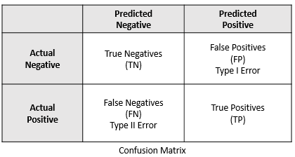
When we make predictions on a test data using a binary classifier, such a Logistic Regression Model, every data point is either a 0 i.e. “a negative” or a 1 i.e. “a positive”. The number of these data points form the actual values. This gives us the following four combinations:
- True Negatives (TN) : are the 0’s which are correctly predicted as 0’s – model correctly predicts the negative class
- False Positives (FP) : are the 0’s which are wrongly predicted as 1’s – model incorrectly predicts the positive class
- False Negatives (FN) : are the 1’s which are wrongly predicted as 0’s – model incorrectly predicts the negative class
- True Positives (TP) : are the 1’s which are correctly predicted as 1’s – model correctly predicts the positive class
Let’s consider the following confusion matrix created from a sample heart disease dataset.
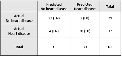
The above confusion matrix can be interpreted as follows:
- Actual number of persons without disease: 29
- Actual number of persons with disease: 32
- Predicted number of persons not having the disease: 31
- Predicted number of persons having the disease: 30
- TN (27): Number of cases where persons actually did not have the disease and the model predicted the same
- TP (28): Number of cases where persons actually had the disease and the model predicted the same
- FP (2): Number of cases where persons actually did not have the disease and the model predicted otherwise
- FN (4): Number of cases where persons actually had the disease and the model predicted otherwise
Precision and Recall are two metrics that are useful when dealing with imbalanced datasets. They are mainly defined on true positives (TP), true negatives (TN), false positives (FP) and false negatives (FN).
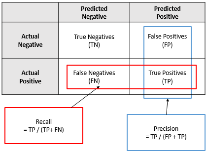
Definition of Precision – Precision is the percentage of correctly predicted positives out of the total number of predicted positives. It is defined as the number of true positives divided by the total number of predicted positives.
Precision measures how many of the positive predictions made by the model are actually correct. The formula for precision is:
Precision = TP / (TP + FP)
Definition of Recall – Recall is the percentage of correctly predicted positives out of the total number of actual positives. It is defined as the number of true positives divided by the total number of actual positives.
Recall measures the ability of the model to identify all positive predictions. The formula for recall is:
Recall = TP / (TP + FN)
Using the above heart disease example, precision and recall would be:
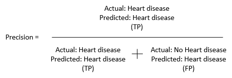
This translates to – of all the people classified as having a heart disease, how many of them actually had the heart disease?

This translates to – of all the people that had the heart disease, how many were classified as having the heart disease?
Plugging in the above values, we get the we get the following precision and recall values
Precision = 28 / (28+2) = 0.93
Recall = 28 / (28 + 4) = 0.88
Higher precision decreases the changes of classifying the person with no heart disease (positive outcome) and low recall because fewer people being classified has having the heart disease (negative outcome).
In precision and recall, negative predictions are not included in the calculations. Also, precision and recall can be applied to multi-class classification problems. Precision and recall are slightly different and give different perspectives to the same model and that is the reason in many cases they are used together. By looking at the precision and recall values, it is easier to understand what’s going wrong in the model and to also improve it. The relationship between precision and recall is often inverse. This means that as one metric increases, the other metric decreases. For example, if a model is designed to maximize precision, it will make fewer positive predictions but will be more accurate in those predictions. However, this may result in a lower recall, meaning that the model may miss some of the positive examples in the dataset.
Precision-Recall Curves in Python
Curves are useful in machine learning because they can capture trade-offs between evaluation metrics, provide a visual representation of the model’s performance, help with model selection, and provide insights for error analysis.
The precision-recall curve a.k.a precision-recall plot is a plot of precision versus recall for different threshold values of the model’s predicted probability. This visualization is especially useful in cases where there is class imbalance or when the cost of false positives and false negatives is different. The curve shows how well the classifier is able to correctly classify positive samples (precision) while also capturing all positive samples (recall). Precision is plotted on the Y-axis and the recall is plotted on the X-axis in the precision-recall space. The objective is to have both a high recall and a high precision, but there is a trade-off – the lower the threshold, the higher the recall and lower the precision.
To create a precision-recall plot in Python, you can use the sklearn.metrics module. The precision_recall_curve() method takes two inputs – the probabilities from train dataset i.e. y_prob_train and the actual ground truth values, and returns three values namely Precision, Recall, and thresholds.
Here’s an example code that demonstrates how to create a precision-recall curve in python:
from sklearn.metrics import precision_recall_curve
import matplotlib.pyplot as plt

# y_test is an array of binary labels indicating whether the sample is positive or negative
# pred is an array of predicted probabilities for the positive class
# Note that pred can be the output of any binary classifier
# y_test and pred should have the same shape

precision, recall, thresholds = precision_recall_curve(y_test, pred)

# Plot the precision-recall curve
plt.plot(recall, precision)
plt.xlabel('Recall')
plt.ylabel('Precision')
plt.show()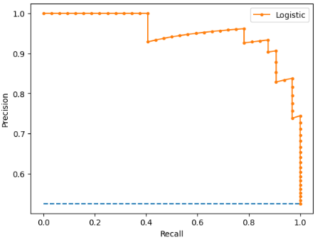
At (0, 0) the threshold is set at 1.0. This means the Logistic Regression model makes no distinctions between the patients with heart disease and those without. At the highest point, i.e., at (1, 1), the classifier represents a perfect model, an ideal classifier with good precision and recall.
What Are ROC Curves?
A Receiver Operating Characteristic (ROC) curve is another widely used predictive model performance metric in machine learning for binary classification problems. Like the PR curve, it is a graphical representation of the trade-off between True Positive Rate (TPR) and False Positive Rate (FPR), at different classification thresholds.
True Positive Rate (TPR) measures the proportion of true positives (correctly predicted positive instances) among all actual positive instances. The formula for True Positive Rate is:
TPR = TP / (TP + FN)
False Positive Rate (FPR) measures the proportion of false positives (incorrectly predicted positive instances) among all actual negative instances.The formula for False Positive Rate is:
FPR = FP / (FP + TN)
A high TPR means that the classifier makes few false negative errors, while a low FPR means that the classifier makes few false positive errors.
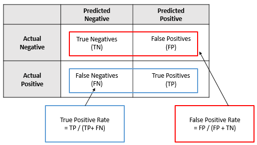
It is important to balance both TPR and FPR, as they have a trade-off relationship. In general, correctly identifying more positives (increasing TPR) tends to incorrectly identifying more negatives (increase FPR), and correctly identifying more negatives (decreasing FPR) tends to incorrectly identifying more positives (decrease TPR). Therefore, it is crucial to find an optimal balance between these two rates, depending on the specific problem and application.
ROC Curves and AUC in Python
To create a ROC curve in Python, you can use the sklearn.metrics module. The roc_curve() method takes two inputs – the probabilities from train dataset i.e. y_prob_train and the actual ground truth values, and returns three values namely Precision, Recall, and thresholds.
Here’s an example code that demonstrates how to create a ROC curve in python:
from sklearn.metrics import roc_curve, auc
import matplotlib.pyplot as plt

# y_test is an array of binary labels indicating whether the sample is positive or negative
# pred is an array of predicted probabilities for the positive class
# Note that pred can be the output of any binary classifier
# y_test and pred should have the same shape

fpr, tpr, thresholds = metrics.roc_curve(y_test, pred)
roc_auc = metrics.auc(fpr, tpr)

# Plot the ROC curve
plt.title('Receiver Operating Characteristic')
plt.plot(fpr, tpr, 'b', label = 'AUC = %0.2f' % roc_auc)
plt.legend(loc = 'lower right')
plt.plot([0, 1], [0, 1],'r--')
plt.xlim([0, 1])
plt.ylim([0, 1])
plt.ylabel('True Positive Rate')
plt.xlabel('False Positive Rate')
plt.show()
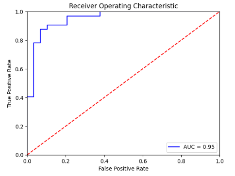
The Area under the curve (AUC) is a measure that summarizes the ROC in a single number. The larger the AUC, the better. In other words, the model performance is better if the ROC curve moves towards the upper left corner. For example, AUC of 0.95 means the model can distinguish persons with heart disease and those without heart disease 95% of the time. In a random classifier, the AUC will be close to 0.5. AUC can be used as a summary of the model skill and can be used to compare two models.
When to Use ROC vs. Precision-Recall Curves?
While both, ROC and Precision-Recall curves measure the performance of a classification model, they each have their own strengths and weaknesses and are useful in different situations.
ROC curves are generally recommended when the class distribution is well-balanced and the cost of false positives and false negatives is roughly equal. The AUC (Area Under the Curve) summarizes the overall performance of the model. ROC curves are useful when the true positive rate and false positive rate are both important and the probability threshold for classification can be adjusted based on the relative importance of these two metrics.
Precision-Recall curves are generally recommended when there is a class imbalance and the cost of false positives and false negatives is different. Precision-Recall curves plot precision against recall over a range of classification thresholds. Precision-Recall curves are useful when the positive class is rare or when the cost of false positives and false negatives is significantly different.
Let’s consider and example of an Information retrieval system. Information retrieval involves finding relevant information from hundreds or thousands of documents. The number of relevant documents will be very less compared to the number of non-relevant documents. In this situation:
- True Positive (TP): Number of retrieved documents that are actually relevant
- False Positive (FP): Number of retrieved documents that are actually non-relevant
- True Negative (TN): Number of non-retrieved documents that are actually non-relevant
- False Negative (FN): Number of non-retrieved documents that are actually relevant
If we consider the ROC curve and plot TPR and FPR, since the number of non-retrieved documents that are actually non-relevant (TN) is huge, the FPR becomes significantly small. Also, here our goal is to focus on the retrieved documents. Precision helps in this case as it highlights how relevant the retrieved results are.
Also Read: What is the Adam Optimizer and How is It Used in Machine Learning
Applications of Precision Recall Curve
Using Precision Recall Curve is particularly useful in situations where the classes in the dataset are imbalanced or the cost of false positives and false negatives is different. Precision Recall technique is used in the following applications:
- Spam detection: Spam detection involves identifying emails as either spam or not spam. Precision shows the proportion of emails identified as spam that are actually spam and recall shows the spam emails that have been accurately identified and classed as spam based on all emails analyzed.
- Recommendation system: Recommendation system predict and recommend relevant items to the users. Precision is the fraction of relevant items in all the retrieved items. It is used to answer how many items among all recommendations are correct. Recall answers the coverage question, among all those considered relevant items, how many are captured in the recommendations.
- Medical diagnosis: In medical diagnosis, a false negative could result in a missed diagnosis and delayed treatment, while a false positive could result in unnecessary treatment or surgery. Precision recall provides a way to measure the accuracy of the test in identifying patients with the disease while minimizing false positives.
Challenges of Precision Recall Curve
The PR curve is generated by varying the decision threshold of the classifier. The choice of threshold can greatly impact the performance of the model. Also, the PR curve may be sensitive to the sampling of the data used to generate it. If the sample is not representative of the overall population, the PR curve may not be a good indicator of model performance. Unlike the ROC curve, which provides a single operating point for a given model, the PR curve can have multiple operating points. This can make it difficult to compare models or select a single best model.
While precision and recall focus only on positive predictions, negative rate or specificity can provide additional information on the performance of a model, especially when the dataset is imbalanced with a large number of negative instances. Negative rate is a measure of how well a model identifies negative instances. For example, a model may have high precision and recall for positive instances but poor specificity for negative instances, indicating that it is misclassifying a large number of negative instances. Therefore, it is important to consider both positive and negative rates when evaluating the performance of a classification model.
Also Read: Introduction to PyTorch Loss Functions and Machine Learning.
Conclusion
A perfect model can perfectly distinguish between positive and negative instances with no errors. However; in practice, it is rare to achieve a perfect model and the performance of most classification models is evaluated based on their precision, recall, ROC, and AUC values. Precision-Recall (PR) curves and Receiver Operating Characteristic (ROC) curves are both widely used in machine learning to evaluate the performance of binary classifiers. Ultimately, the choice of evaluation metric and curve will depend on the specific problem and goals of the task at hand. It is important to understand the strengths and limitations of each approach to select the appropriate evaluation method for a given problem.
References
Fabio Sigrist. “Demystifying ROC and precision-recall curves”, 26 Jan. 2022, https://towardsdatascience.com/demystifying-roc-and-precision-recall-curves-d30f3fad2cbf. Accessed 07 Apr. 2023.
“Precision-Recall Curve in Python Tutorial”, Jan. 2023, https://www.datacamp.com/tutorial/precision-recall-curve-tutorial. Accessed 07 Apr. 2023.
“Precision-Recall Curve | ML”, 21 Feb. 2023, https://www.geeksforgeeks.org/precision-recall-curve-ml/. Accessed 08 Apr. 2023.
Purva Huilgol. “Precision and Recall | Essential Metrics for Data Analysis (Updated 2023)”, 15 Feb. 2023, https://www.analyticsvidhya.com/blog/2020/09/precision-recall-machine-learning/. Accessed 08 Apr. 2023
Pratheesh Shivaprasad. “Understanding Confusion Matrix, Precision-Recall, and F1-Score”, 19 Oct. 2020, https://towardsdatascience.com/understanding-confusion-matrix-precision-recall-and-f1-score-8061c9270011. Accessed 11 Apr. 2023.
ritvikmath. “The Confusion Matrix : Data Science Basics.” YouTube, Video, 8 Feb. 2023, https://youtu.be/LxcRFNRgLCs. Accessed 15 Apr. 2023.
Finance, R. studio. “ROC CURVE.” YouTube, Video, 19 July 2018, https://youtu.be/MUCo7NvB9SI. Accessed 15 Apr. 2023.
